Archive edition for the week ending 26 September 2026. Prepared and added on 19 October 2026. Period coverage and current primary documentation were checked on that date. This is an editorial research guide, not a hands-on review.
AI image news can make a polished poster look like the end of the design process. For a creator, it is often the beginning. You still need the right words, consistent colours and an output you can use when the brief changes.
Ming-Image-0.1-Design appeared in the chapter list and source links of ReSearch AI's 23 September roundup. That establishes period coverage, not a ranking of its popularity. It offers a useful starting point for examining what a design-focused model actually provides.
What the project documents
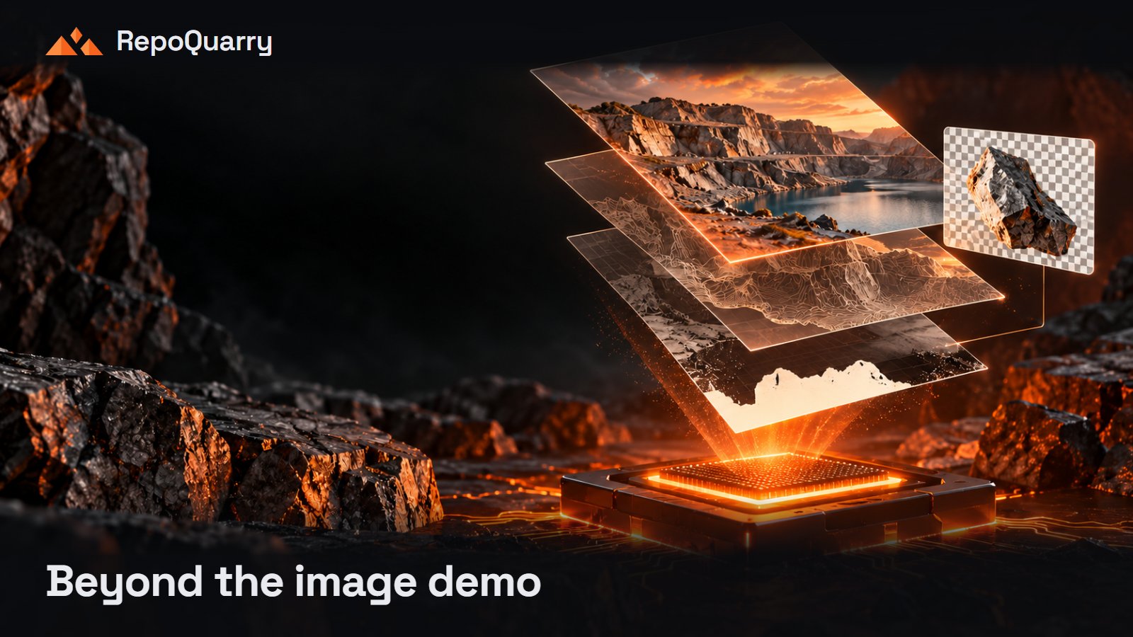
The official model card describes a 6B text-to-image model for interfaces, infographics, posters and other designs containing text. It supports transparent RGBA output and links installation and inference code. The card labels the model MIT licensed.
Its documented validated configuration uses a CUDA GPU with 80 GiB of video memory. That is an important distinction for anyone expecting a casual laptop download. These are current documentation details checked when this archive was prepared; they should not be read as a preserved snapshot of the September instructions.
A rendered design is still an image
Do not assume that an attractive interface illustration is a functioning interface, or that a generated poster arrives with independently editable text and layout objects. Verify the output format before planning the rest of your work around it.
Our suggested first test is deliberately ordinary: a workshop announcement with a title, date, location and booking instruction. Use invented event details so mistakes cannot mislead anyone. Ask for the same information in two different layouts.
Then check the result at the size people will actually see it. Read every character. Look at the smallest line, the spacing and the contrast. A strong central illustration cannot compensate for an incorrect date.
Test the next change, too
The revealing part comes when the brief changes. Replace the date, shorten the title and request a different aspect ratio. Record which elements remain consistent and which require rebuilding.
If transparency matters, place the exported asset on both light and dark backgrounds. Check the edges and confirm that the background is actually transparent. A preview checkerboard is not sufficient evidence on its own.
This is a proposed evaluation, not a result we have measured. Its purpose is to reveal the work that remains after the first attractive generation.
Work out whether it saves a real step
Before choosing a deployment route, check the current requirements, licence file and any provider charges. Compare the total effort with your existing process: generation, correction, resizing and export.
The useful question is whether the model helps you produce a deliverable you would otherwise spend time making. It might be valuable for concept exploration even if final typography still belongs in a design editor.
Discover candidates through RepoQuarry, follow the project sources and bring a small real brief to the trial. The best evidence is a usable output and a manageable revision.